Learn to Code (Part 4) Complex Layouts: Demystifying the Float
Layout Methods that we will cover
- floats + clearfix
- flexbox
- css grid
The Dreaded Float-based Layout
OK, so here's the deal. We don't really use floats anymore for building layouts.
Why?
First, they are difficult to understand and they are not fun to use (they are fun to understand, though).
Second, using the float property to build layouts was a hack from the start. It took a thing that was never meant for layouts, and it was used in ingenious ways by the community at the time to overcome layout challenges that were not possible in any other way.
Originally, floats were used to push an image to the right or left inside of a block of text, and the text would float around the image, hugging the border of the image. This has its origins in print design. This behavior was hijacked in order to solve problems relating to layouts.
So why should I learn how to use float-based layouts to begin with?
If you learn float-based layouts - you can do anything.
When I was 15 and learning how to drive, my parents insisted that I learn to drive first with a car that had a manual transmission. Their reasoning was this: If you can drive a manual transmission vehicle now, then there will never be a car that you cannot drive. And in an emergency, you might need to know.
The same logic goes for floats. It is entirely possible that you will inherit a code base that uses float-based layouts, either throughout the entire project or in an isolated, perhaps legacy, portion of that codebase. And the day might come where you need to modify, enhance or revise that portion of the codebase. And in this case, you would not need to rely on anyone's knowledge or experience to help you because you understand how float-based layouts work.
Building A Multi-Column Layout with Floats
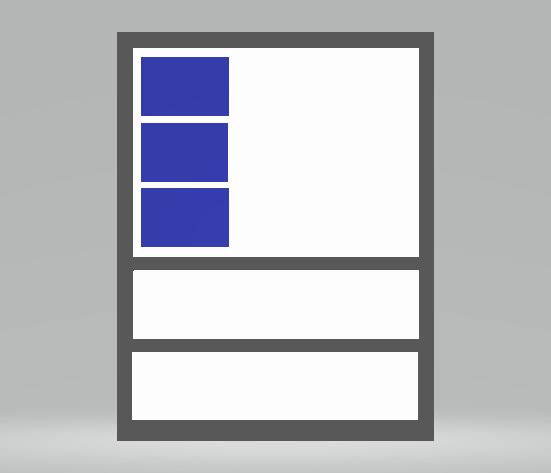
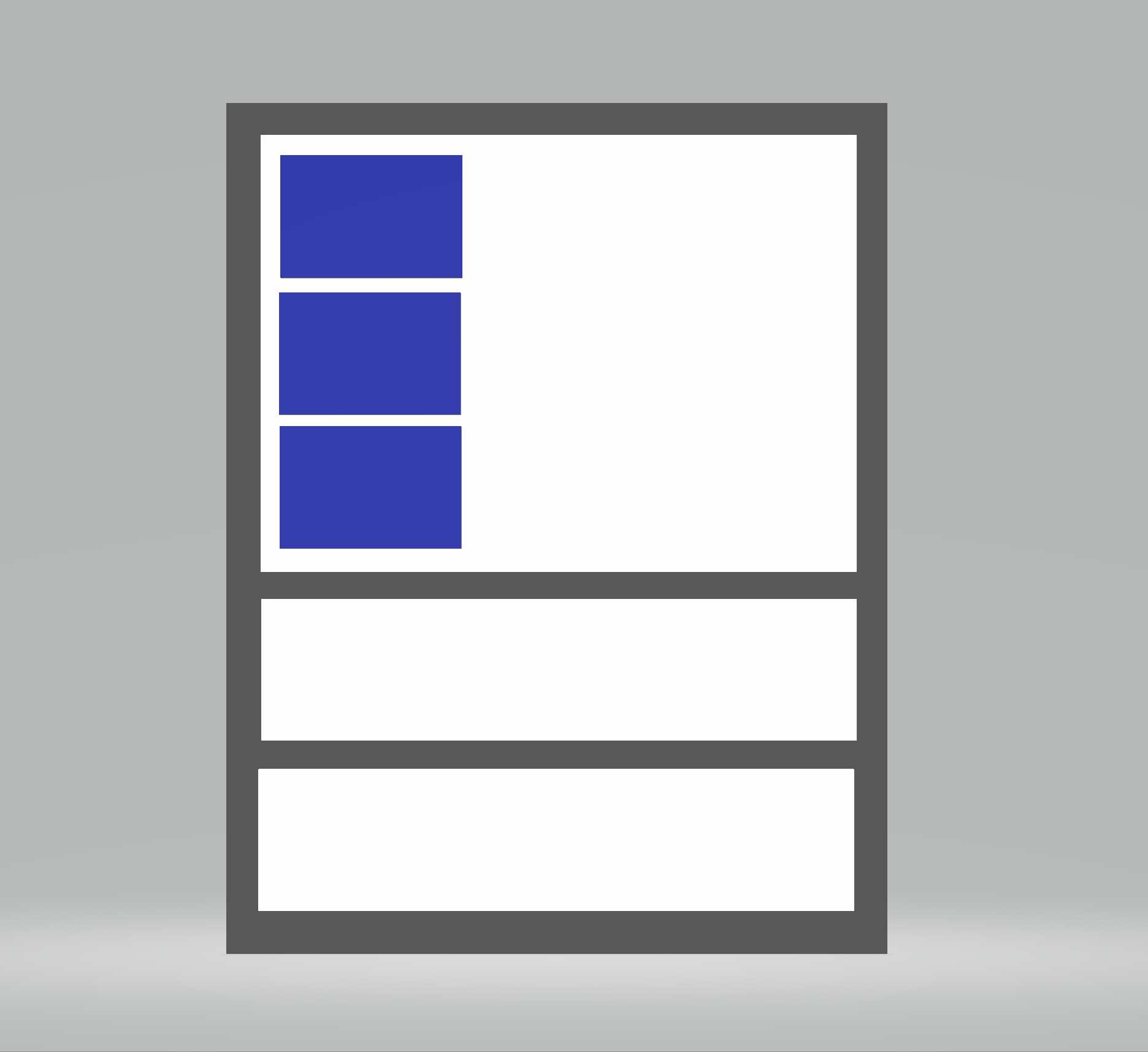
This is what we'll start out with:
Here's how:
<style>.row {width: 100%;}.column_one-third {width: 33.33%;}</style><div class="row"><div class="column column_one-third"></div><div class="column column_one-third"></div><div class="column column_one-third"></div></div>
Because each div.column here has a display: static; by default, it will behave like a block element, taking up the entire width of the page regardless of the fact that we have set the width to 33.33%.
In order to get each column to sit next to one another side-by-side, we could say:
.column {display: inline-block;}
...but that would only get us so far, since now only two of the three columns would be sitting next to one another. It is hard to see why our inline-block elements don't sit next to one another here because we have properly set the width on them to be exactly 1/3 of the width of the parent element - yet they don't.
That is where floats come in.
Let's float our columns.
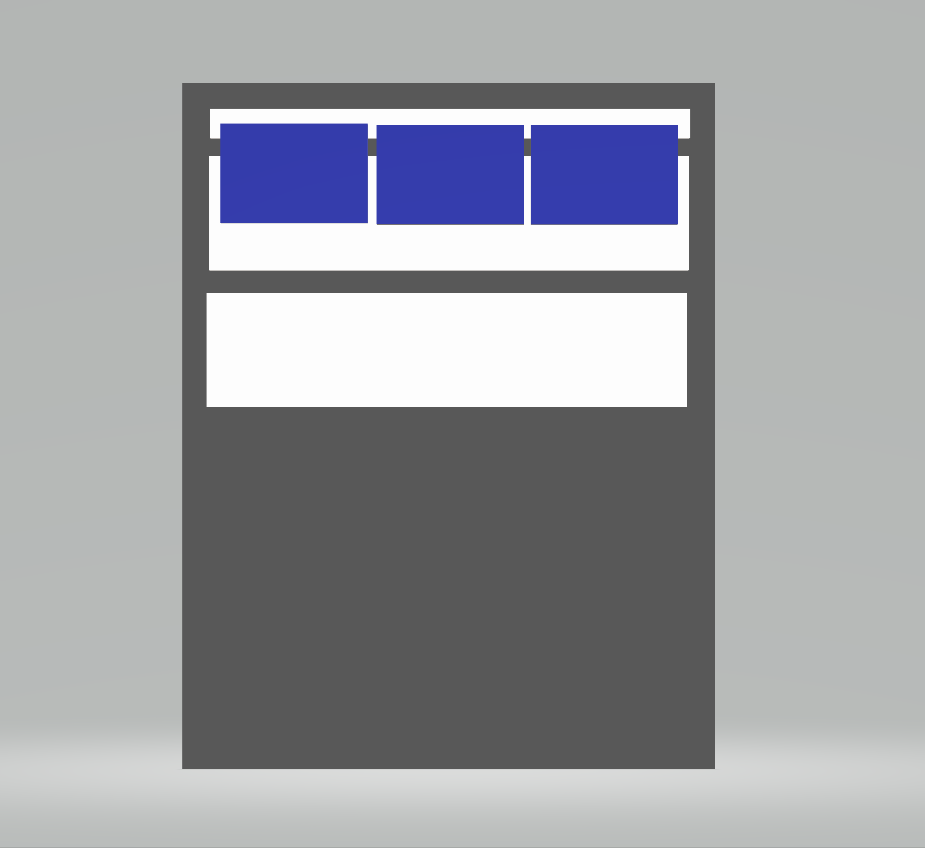
.column {float: left;}
When we float elements such as our .column elements, we are literally pulling that element or those elements outside of the normal flow of the page.
Because of this, the parent element - if it contains only elements that have been floated - collapses as if it had no nested elements at all. Here's a demonstration of that behavior:
In order to restore the natural flow of the page, we need to clear out any floating behavior and let the browser know that, Hey, it's cool, I know I messed with how you do things, but now I want you to resume from this point on as normal.
A way to clear floating behavior - commonly referred to as a clearfix, can be done like so using a css psuedo element:
.row:after {/**/content: '';display: block;clear: both;}
Notice that we apply to the clearfix on the parent element that holds the elements that have been floated, not the floated items themselves.**
The psuedo element of :after allows us to programmatically insert an element via CSS into our page just before the closing tag of the parent. By inserting the element there, any floated items (and their floating behavior) that came before it inside of the parent element will be cleared by our clearfix solution.
🛠🛠🛠
Stay tuned for Part 5 and 6 which will cover flexbox and css grid respectively.