Learn to Code (Part 3): Demonstrating the Box Model and the impact of the box-sizing property
What is the Box Model?
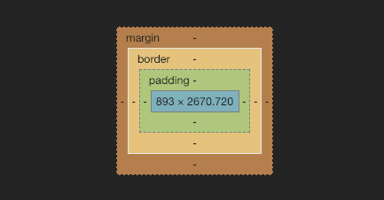
The Box Model is the "mental model" that we can use to understand how to position, create space within and outside of our HTML elements, as well as aid us in creating complex and fluid layouts.
In short, the box model is a representation of the core attributes that every HTML element has. Those core elements are:
- content box: space where our children elements go.
- padding: space that is created and pushes inward into our element.
- border: space for our border, pushes outward depending on border-width value.
- margin: space that is created outside or our element, and pushes outward.
Each of these attributes acts like a layer. A lot of people say it is like an onion.
I think a more accurate representation of the box-model is to think of your own body.
First, we have our content-box: where our inner organs exist.
Second, we have our padding: the layer of fat that insulates our organs.
Third, we have our border: our skin.
Lastly, we have margin: this is the invisible space that we like to maintain between other people. Personally, I enjoy a solid two-foot radius to be comfortable. This is the equivalent of margin when talking about HTML elements and the box model.
In order to create polished User Interfaces, we use a combination of padding, border and margin to create space and order.
However, one property seems to trip up both new and experienced developers alike when it comes to the use of border and padding when creating layouts. Specifically, making a box 100% of the width of the parent element - and it ends up being more than 100%.
We are going to explore what is happening behind the scenes to better understand this problem, as well as a common CSS fix that we can use to ensure consistent behavior.
A demonstration of box-sizing
If the box-model is a representation of the different layers each element has, box-sizing is the property that allows us to tell the browser how we would like it to calculate that elements' width.
You have two options for box-sizing:
content-box: the default value is box-sizing is not explicitly set.
.some-element {box-sizing: content-box;padding: 20px;width: 100%;}
In the content-box scenario, the browser will apply the value of the width to our element's content box. The 20px of padding applied to the element will be additional, causing our element to explode from the parent container by 40px (20px on the left + 20px on the right).
border-box:
.some-element {box-sizing: border-box;padding: 20px;width: 100%;}
In the border-box scenario, the browser will apply the value of the width to our element's content box, but it will take into consideration any values that are also being applied for padding and border. The 20px of padding applied to the element will be accounted for. In other words, 40px (20px on the left + 20px on the right) of padding on our element will be folded into the total value of the width.
The difference between these two scenarios is illustrated below. Try toggling the states and take note of the different resulting behavior of our nested element.
Universal box-sizing fix
While it is helpful to know how and why this occurs - I generally do not want to have to think about how my browser is applying a calculated width value to my elements.
To ensure all the elements follow the same behavior, I can use the universal selector of * and state it at the top of my stylesheet.
* {box-sizing: border-box;}
Stay tuned for Part 4, where we dive into the many ways we can build complex layouts using HTML and CSS.
😄